
Table of Contents
Detailled View
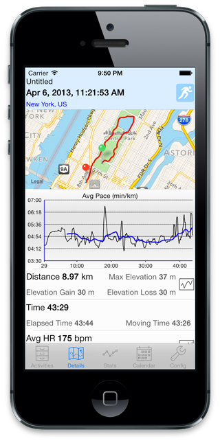
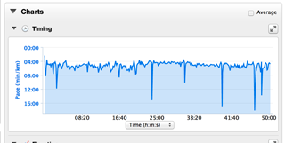
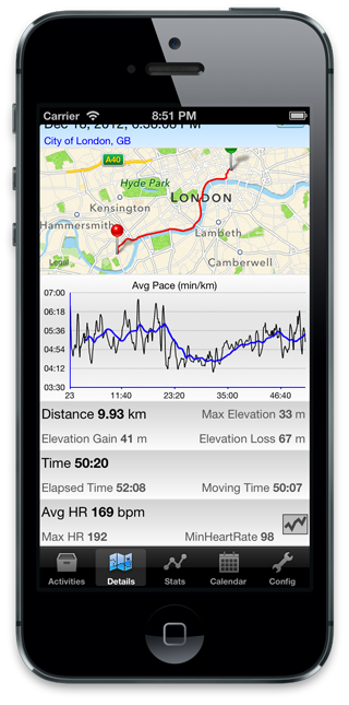
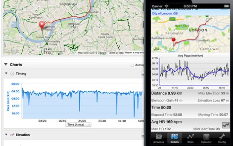
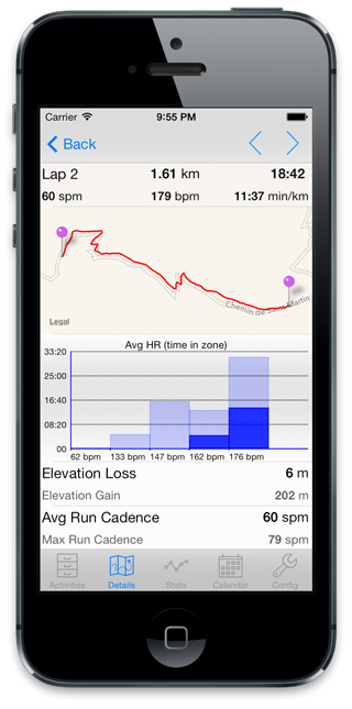
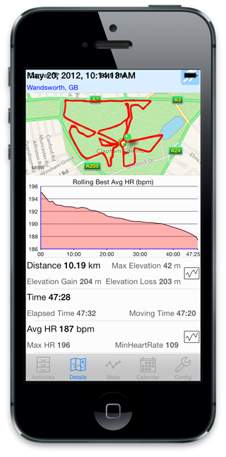
If You can select any activity you will be presented with the detailled view. You can zoom and drag to reposition the map. Tapping the map will bring the map full screen. Tapping the graph will rotate through different fields to display. The blue line on the plot represent a moving average to get a sense of the overall trend factoring out the noise of some data like speed.
Below the graph you find different statistics for the graph. The icon ![]() indicate a field you can select to display the plot of the field during the activity.
indicate a field you can select to display the plot of the field during the activity.
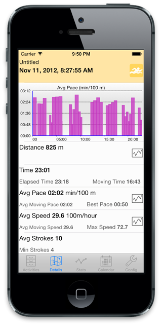
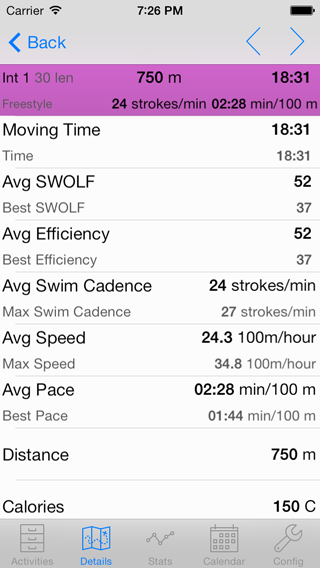
Note that swimming activities will have slightly different graphs and no maps as the data for these activities is quite different
Navigation of the plots
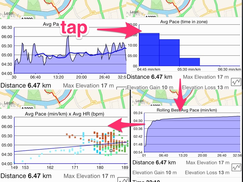
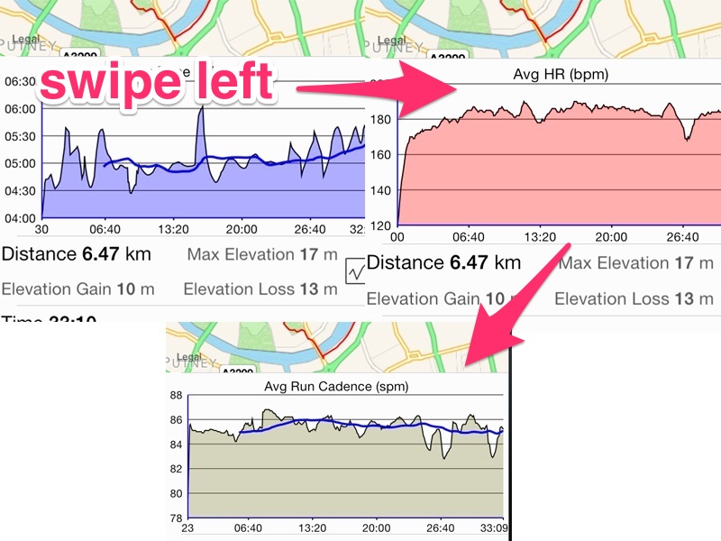
Different plots can be seen in that page. They are grouped by fields like pace, heart rate, cadence, etc. You can tap or swipe to the left. Tapping will iterate through all the plots relevant to that field, then move on to the next field. Swipe to the left is a convenient way to move on to the next field.
Map of the activity
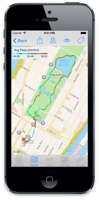
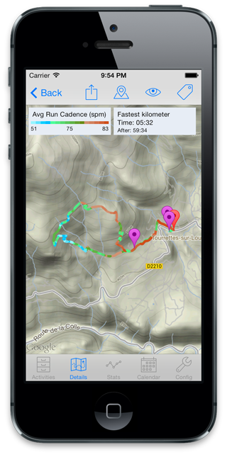
When you tap the map you’ll be presented with a full screen view. You can tap the icon on the right to rotate through different gradient overlay on the map. Here for example it shows the pace. The other icon let you show the lap marker or switch the map from satellite or map view. you can also press the sharing icon to use this view as a snapshot when posting to twitter or facebook.
Plot of an activity detail
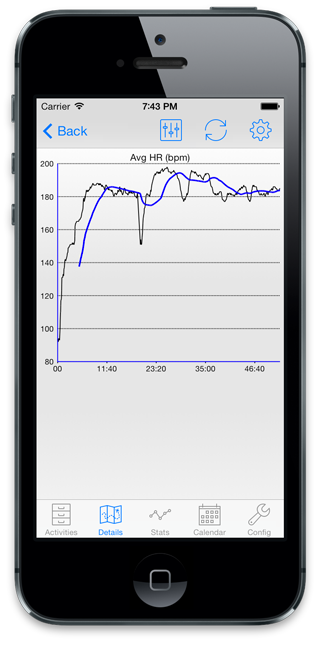
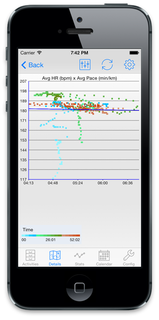
when you select a plot for a field in the activity you can then use the gear icon to rotate through different views. First you’ll get the plot over the time of the activity with different moving average overlay. The moving average is the blue line that lets you get a sense of what is the tendance of your speed of cadence when the original signal is quite noisy. Taping further you will see scatter plot against different field. Combinaison of particular interest are speed vs heart rate, speed vs cadence, power vs cadence, etc
In the scatter plot, the color indicates the time of the point within the activity: blue are the earliest, then green then red for the end. The blue line is the regression line of the fields against the other.
Smoothing
Note that the app will apply some smoothing when plotting noisy measures like speed and cadence, so you don’t see the raw data serie. In addition the moving average can give you a better sense of how your speed really varied over the run, so here is for example the same activity with the original plot from garmin connect and the smoothed version from the app. I feel what really happened in that run is clearer on the smoothed version: slow start, faster in the middle and slower again at the end.
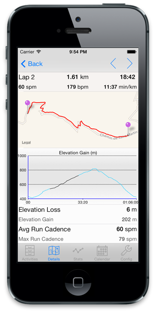
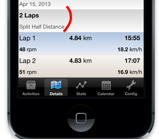
View laps of an activity
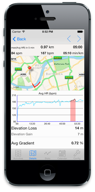
These show you detailled information for each lap. You can also bring the map full screen by tapping it. Note that on the graphs you’ll see the full plot with highlighted the portion corresponding to the current lap
For lap aswell, swimming activities will look quite different
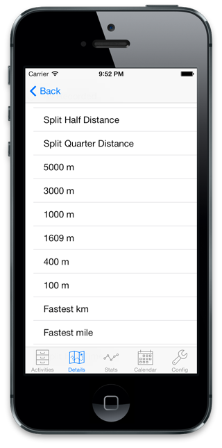
Auto laps for an activity
It is also possible to look at calculated laps based on fixed distance, time, split distance, fastest kilometer, etc. For that tap of the cell displaying the current Lap count
It will the show you the following page to select which rule you want to calculate your laps. You can then look at them the same was you can look at the recorded laps
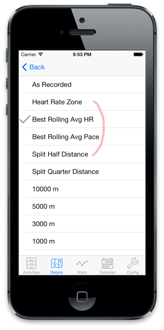
Best Rolling plots
Best rolling plot represent the maximum HR, pace or power you achieved for any given period of time, from 5 seconds to the length of the activity.
You access them by tapping on the plot into the detail page.
They are quite expensive to calculate, so they are calculated on a re-sampled curve every 5 seconds. This can result in small loss of precision from the original data. Simply tap on the plot to iterate until the plot is displayed. Note that on a slow device or long activity, it may temporarily display “Calculating”. These plots can be displayed for pace, HR or power (Critical Power plot)
Once a best rolling plot was calculated and displayed, a new corresponding auto lap will appear. This will let you look at the best rolling lap for key periods
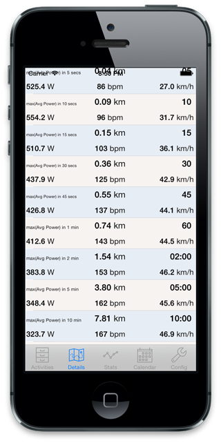
If you select one of these laps, you’ll be able to see on the map or on the plots where you achieved that best period
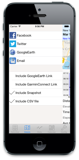
Sharing an activity
Drag the detail view to the right to reveal the sharing page.
Facebook or twitter will present the standard dialog to post on the respective service.
Pressing google earth will open the app google earth if you have it installed. This can result in quite better view than the native map, as this comparision image shows
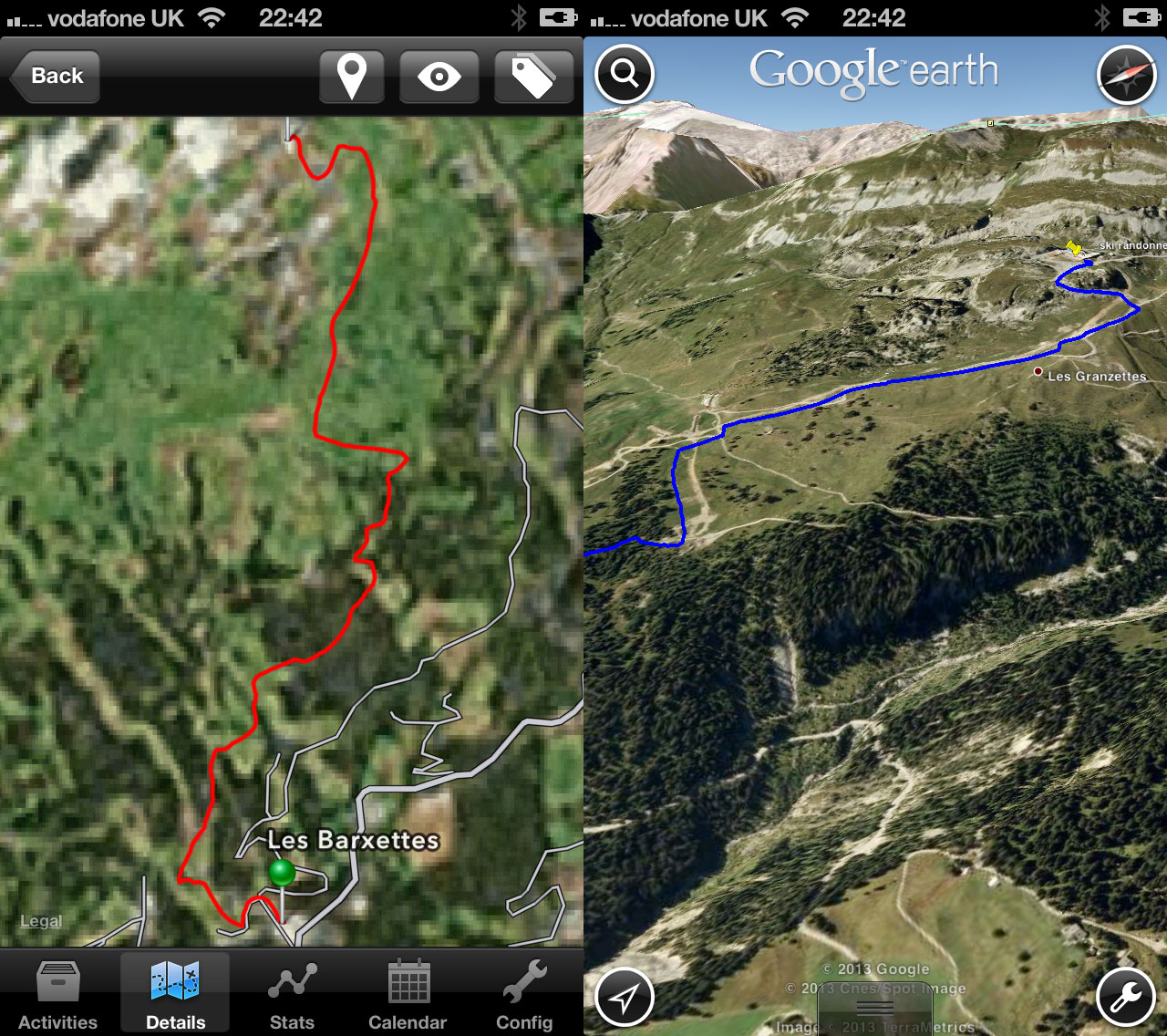
Strava will export the current activity to strava
Email allows you to email a snapshot or the google earth file so you can for example use google earth on a compare to explore the activity in fun ways.
 
You can choose what you want to include in your post or email: a link back to the google earth file, a link to the garmin connect activity view or a snapshot of the current screen (either the detail view or the map
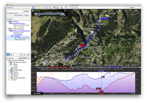
Using Google Earth with ConnectStats
If you open the google earth file with google earth on a pc or a mac, you will be able to see you heart rate, cadence or power data in the elevation profile tab. Right click on the activity on Places pane et select Show Elevation Profile. You should then be able to see a graph with your data.
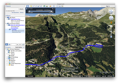
After expanding and selecting the track of your activity press the icon ![]() to have google earth replay the track you followed.
to have google earth replay the track you followed.
To get the google earth file, you can either email it to yourself from the sharing pane or use the link from a posting on facebook or twitter.
Great app, thank you. Is there any way to get the map full screen on the iPad, like the graphs?
the full screen is not working very well, it truncates the page, I need to make it work and then get the full screen for maps. But not yet done.
In some plots, it should say “elevation” instead of “elevation gain”
Correct – this is especially obvious in scatter plots. E.g. “heart rate x Elevation gain” in reality shows “heart rate x elevation” — which is not really useful. My heart rate shouldn’t change much if I run at 100m or 200m altitude; but running up a steep hill of 100m does change my HR quite a bit 🙂
Hope Brice fixes this one day…
Hi,
I’m using an iPad but don’t have a map showing on my detailed view of an activity.
Any idea why?
Do you have any map at all? You may want to send a bug report after trying to look at the activity, and select include activity data so I can have a look
Is there a legend for the gradient colors overlaid on the map.