April outage

It had been a while, but this week, ConnectStats started to fail to access the data from Garmin’s website due to a change on the API.

As usual, I have removed the app from sales while I sort it out, and disabled the bug reporting.

I have now figured out a fix, and will push it to the store very soon after some testing, likely before this weekend (April 20). As soon as the fix out approved by apple, I’ll put the app back on sales and people should be able to update and get it working again.

Solution to two recent problems

I received quite a bit of feedback on two issues recently, but wasn’t very responsive… My excuse? I was on vacation, Yay!

Error Updating

Since a few days ago, people receive an “error updating”. It will loads the latest activities. but stops, which is both annoying and plain bad if you have more than 20 new activities as it won’t download the remaining. This is due to another API change, the access point ConnectStats uses to download the power zones changed. So as quick fix, I removed the downloading of power zone and will add it back when I have a bit more time. A new version 4.4.2 is on its way with this fix.

Missing old activities

Quite a few people had issues downloading old activities. A new version should address the issue. If you were affected, once you have the new version 4.4.3, you should go to    config, select Current Profile and Force Download Old Activities. This should try to download again everything.


Weather Bug (Crash on import)

Yet another small change in the garmin API (related to the weather), that result in a crash of the app. I have put so many guards around the code for API change, but seems there is always one I am missing..

I am pushing a new version to the store, so hopefully this should fix most of the recently reported crashes.

Important release to correct data import problems

A new version 4.4 is now available.

This fixes the issue around missing data on import, as well as incorrect units for some fields like min or max elevation.

Bad Release Problem Solved!

As a bonus, I added support for Garmin Device Power while running, as least for the devices for which users sent me sample fit files.

Missing Data

Because of my own silly bug, ConnectStats was not trying hard enough to look for all activities on the initial download, and was stopping too early, resulting in missing older activities. This is now fixed in 4.4. But it’s hard for the app to know if it missed old activities or not. So if you think you are in that situation, the best is to force the app to reload all activities, by going to “settings”, selecting “profile” and “Force Reload Old Activities” as below. This will start a download that will try to reload everything, it will also help fix data previously imported with incorrect units.


Incorrect Units

Even though I have build a lot of tests over time, it is always difficult to make sure when a new API changes that the app is behaving properly. This is due to the fact that the API is undocumented and that I have limited scope for testing of new features, given that I do it on my own. I basically only test on my activities and the activities people have sent me over time in the past. Though we should not complain about the lack of documentation given as mentioned in the past, this API is not intended for external use, but just for garmin own website… So I am just grateful Garmin lets ConnectStats continue to use it, even if we just have to reverse engineer everything.

To illustrate the issue and give people a feel for the reason behind some of the bugs, the bad units were due to inconsistencies in the scale of the number depending on which data you were receiving: summary or detail for an activity.

In the summary the elapsed duration data comes as milliseconds:

While in the detail file it comes as seconds…Beside the elapsedDuration, maxElevation and minElevation everything else is consistent… Go figure… These are hard to anticipate and catch when you test on your own, so I want to thank all the users who have the patience to report details about such bugs and also the patience to wait for me to push fixes.


Missing activities bug

A new embarrassing bugs slipped through the release of the new api connectivity… As some users reported, if you try to download from a fresh install, you will miss older activities.

I am quite upset I missed this bug. My testing of the new API was on a test account with a limited number of activities and did not exhibit the issue…

Anyway, I have a fix, and will release soon now.

You can Follow progress here

Power Hiking with @strydrunning now in @ConnectStats

Stryd added power support for hiking. And given I wanted to do a few hikes during my trip in Japan, it was the perfect opportunity to make sure it get processed properly in ConnectStats.

Of course in doing this and after some feedback from other user, I realised there were some other data not displayed in the hiking activities, as well as information missing from the new garmin API that I could add.

So I will push a new version 4.3.1 that will addresses some of these issues.

Here now power displayed in the hiking activities. Along with all the other view you get on running activities.

Just for the fun of it, I compared the best rolling plot of a hiking easy climb to a flat run. Clearly the power is lower, especially on average factoring the descent, but the burst on the climb almost compares to the run…

What the Alternative API mean for ConnectStats

Most users experienced new activities from Garmin not syncing up with ConnectStats since last week (March 23rd or so). As described in the last post, it can be fixed by using an alternative API.

It looks like it’s going to be a permanent change. It also has some minor consequences for users.

What is the alternative API?

It’s probably obvious to most of you, but the API is the mechanism that third party (ConnectStats) can use to access the data stored by a provider (Garmin or Strava).

Garmin a long time ago had a public API to access the activities recorded in Garmin Connect. Back in 2014, Garmin decided to change it’s approach to third party. While the old API allowed a third party to access directly the running or cycling data from Garmin servers, they decided to switch to a push approach. The key consequence is that a third party now has to build and maintain an infrastructure to store the data in the cloud after it was pushed by Garmin. This is great for a platform like Strava, it makes for a great user experience. But it’s impractical for small independent hobbyist developers like myself with ConnectStats like app.

While Garmin announced they would deprecate the old API in 2014, in practice until last week it continued to work more or less. It just had regular tiny changes, which beside the fact that the change came as a surprise outage to developer via lots of sudden bug reports, they were usually easy to keep up with.

The old API continued to work and was used by their own Garmin Connect website. since they upgraded their website to the new look shortly after the API announcement, they also slowly started to upgrade the site to a very different API. This is what the settings “Alternative API” refers to.

Practical Difference between the two API

ConnectStats downloads data in two stages. The first is to get a summary of all recent activities, which is intended to be faster. Then when you go and look at an activity in details, it will downloads all the individually recorded data point to create the graphs and the track on the map. The details can be a lot of data, so it’s an optimisation to only download the summary first.

The main difference between the two APIs, is that the new one (alternative) contains a lot less information in the summary. Using the new API, a lot of the extra information (for example: running dynamics, min and max, etc) will only be downloaded while getting the full detail of the activity. It’s not a major issue, as in practice when you select an activity, you need to wait a bit for the graphs and map data anyway.

Where it can impact the user experience is in some of the historical statistics pages. Some historical statistics on the extra information will be missing until each activity detail is downloaded. To mitigate the issue, ConnectStats tries to automatically download the last dozen or so activities that are missing detail.

Will the old API come back?

Only Garmin knows. But at this point I would anticipate it won’t. ConnectStats lived on borrowed time since 2014 when they announced they would deprecate the API.

Also the behaviour of the old API is not that it errors, but it contains a lot less data (almost none). In the past changes, it always was either some error, or some subtle change that broke ConnectStats use of the API. This time feels different.

What’s next?

I am releasing a new version of ConnectStats (4.3) that will by default use the new API. I keep the setting to switch back, in case things change in the short term and to keep optionality.

As in all the previous discussion on API change, I also continue to prepare for a day when Garmin may completely shutdown the API ConnectStats uses.

At such time the only option to continue using ConnectStats will be to switch to another service provider like Strava.

Using Strava data though has the drawback that it contains a lot less details on each activities (no running dynamics, etc).

Alternatively, now the the app is open source, if it comes to that we may link it to other service and hopefully the app will continue to live.


Activities not updating, how to fix…

Today, Friday march 23rd, 2018, the garmin api ConnectStats uses by default is not returning any new activities. It can be fixed by switching to the alternative api supported by the app.


This happened already in the past, but it was temporary then. Garmin API Change: Good News Bad News,

Assuming this is a permanent change, I’ll try to release shortly a new version that will by default use the new API. Meanwhile people need to switch manually if they see the issue.

Similar Summary Stats, Different effort…

While I still need to figure out how to use the new power field from Stryd, Running Power is already a useful other way to compare the type of effort of different activities. Since I got the new pod, I have been motivated to go out run more, and looking at the last few weeks, I realised that a few runs had interestingly some similar headline stats but very different feel. So I decided to see how ConnectStats displayed the differences.

In the summary, you can see the first two have very similar heart rate average, but very different pace, while the run in Shanghai has similar pace as the first one, but higher heart rate. The run in the new territories run (Hong Kong) is also interesting to compare to the Putney run (Richmond Park). Let’s dive in.

Comparing Activities in ConnectStats

You can easily compare two activities in ConnectStats by sliding the activities in the list and selecting mark. The activity will then shows in the background of the new one you look at.

A mark will be displayed to remind you which activity is the “compare” activity.

Same Heart Rate, Different Pace

The first two run to compare have an average of 176 and 175 HR respectively but a pace of 4:50 and 5:30. You can of course just look at the pace plot on top of each other, but it’s a bit messy

Note that the map will show you both activities, useful when they are on the same location, but less when they are quite different route, as here. The pace graph clearly shows that for large part of the run the pace was faster, but not very insightful. A much better way to compare the effort is to look at the best rolling plots.

You can see that it was definitely a higher power effort, but the pace shows that the slower run had more constant pace, flatter curve. The heart rate plot shows that the max effort (left part of the curve) was similar, but the tail was lower (steeper curve on the right for the faster curve). Overall a less consistent effort, but where I pushed more at time and resulted in the same average heart rate but very different pace. The power curve interestingly shows quite a higher effort. These were two different runs, the slower one was a commute run, with a backpack and on city streets with more stop and go at light. It was also early morning, so typically not when I do my best performances…

Same Pace, Different Heart Rate

We can also compare that same activity to another run a week ago with same pace (4:49 and 4:50) but higher heart rate (181 and 176 respectively).

You can see the activity being compared to (lighter colour) has clearly higher heart rate effort through out. One interesting observation is that the lower heart rate run has steeper start, which means there were a few period where I pushed rather than a continuous effort .The pace on the other hand has a quite a different profile between the two runs

The lower heart rate run has a much steeper shape, while the other one has a quite flat profile, meaning a more constant effort.

Now for the new measure of power, again interestingly the raw graph comparison is quite useless. Hard to really see much in the difference of the effort.

 But the best rolling graph again shows a very interesting story, if somewhat consistent with the other. While the effort was about the same, the higher graph shows a much more varied effort: more power on shorter time period, but converge at the end for the overall time.

The higher heart rate was just a run where I tried to push much more through out and consistently. Quite interesting that it resulted in the higher heart rate…

If you wonder why the little bump around 5min, me too! this is an annoying little bug or quirk which I haven’t yet figured out!

Time ahead

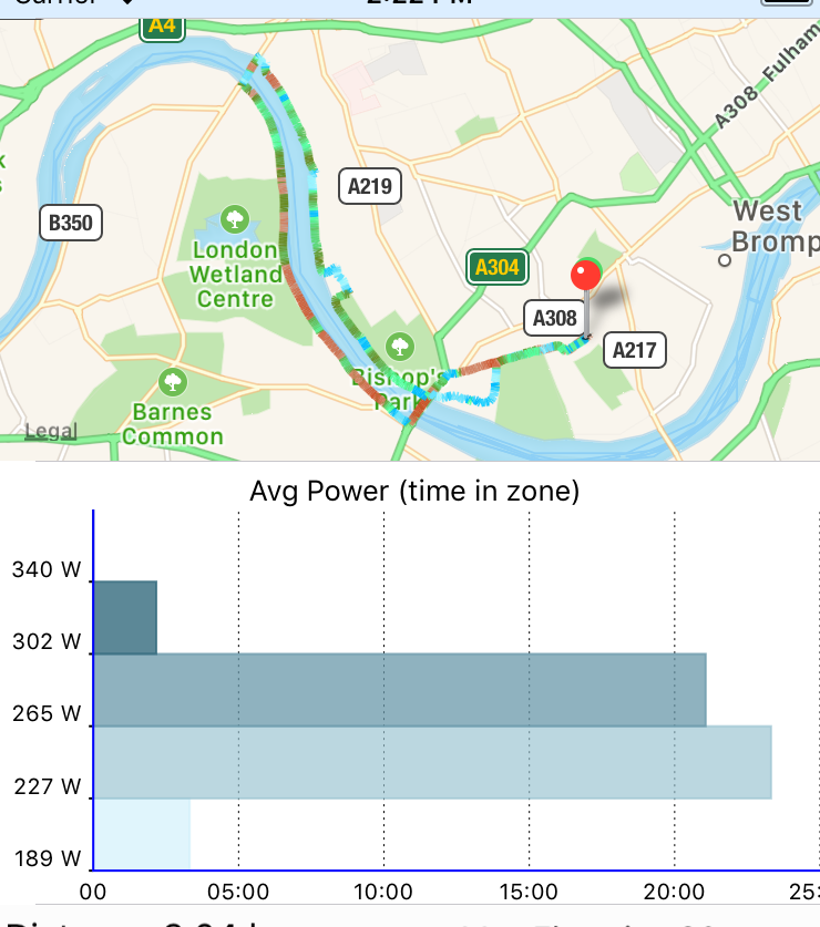
A last graph that maybe of interest, even though in this specific case, maybe less interesting in this specific case, but it shows you the time ahead (or behind) from the compared activity. The big straight drop are pauses. So you can see that I took quite a few pauses in the lower heart rate run, and it had period where I was catching up (upward slopping) and period where I was getting behind (downward slopping). On the map, the area where I am ahead are blue, and then goes to red when I am behind. Which makes it easy to see where you are behind or ahead, especially when the run is at the same place (not the case here).

Hope you found this interesting. Happy Training.


ConnectStats now supports #RunningWithPower for @Strydrunning!

ConnectStats now supports power for running with the latest version 4.1. This was an exciting few weeks for me, as I discovered the Stryd pod and started to incorporate power in my running. It was also a good opportunity to develop something new in ConnectStats.

Running Power in ConnectStats

If you have a stryd foot pod and use the Connect IQ field from stryd, after you record a run activity and download it to ConnectStats, you’ll be able to see the data in the activity field as below. You can of course see power as a graph, along with the other fields like leg stiffness and form power. 

One of the key reason I wanted to add power to ConnectStats was to be able to graph the  power curve, similar to what is available for cycling. This is one of my favorite plot in ConnectStats and show well how a given effort compare to other. 

ConnectStats will of course also display other useful graph like power in zone, lap view of your power, etc, etc.

Historical View of Power

The key benefit of the power curve or rolling best power is to compare from month to month the effort. So you will see in the summary statistics along with best pace and best heart rate your best achieve curve for the month, here is my curve for February.

I only got the stryd pod a few weeks ago, so I don’t yet have another month to compare, but to give a sense, here is what the comparison looks like for cycling

You can see here that the month of feb had higher best power achieved for longer, meaning I pushed more this month than the previous ones…

My experience with power so far

First, it came at a very good time, as you can see in my performance graph, I had been a bit lazy in my training and I was on the low side of fitness. Getting the Stryd, as any new sensor gadget/toy, provide a big motivational boost to get out and run more. The spike up of the performance graph in February clearly demonstrate that.The power while you run seems to be picking up hills or sprint effort pretty well, as this graph focusing on a hill in a lap of a run in Richmond park.I am looking forward to getting more insight and ideas how to incorporate running in my training. How leg stiffness will improve over time or form power, etc.

Please feel free to comment and suggest the types of statistics you would find useful to see with this new data, and I’ll try to incorporate in the app!

Happy power running!

Bonus for Mac users

I also updated Fit File Explorer to process third party field, so when opening a fit file with power data you can see it.

You can also do comparison between for example the data from the HRM run and the Stryd on vertical oscillation or other field recorded by both sensors